SDLC Design System
CONCEPT
As a consulting firm, SDLC Partners not only provides services to external clients but also owns a number of in-house projects. These in-house projects often suffered from aesthetic inconsistencies and bad UX due to finite resources. Having an in-house design system — an inclusive, constantly evolving ecosystem where everyone is invited to participate, efficiently solved this problem.
User:
Designer
Developer
Goals:
It becomes much easier to create consistent experiences across different platforms.
Scale: There’s more space for exploration because designers are no longer reinventing the wheel.
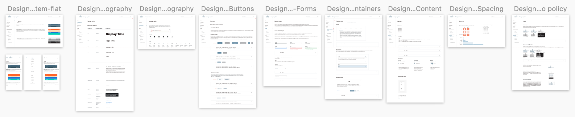
Design Systems provide a shared library of reusable components and guidelines. Building products becomes much faster.
Team size:
1 Designer and 2 developers
Check out the demo!
PROCESS
Here are some metrics I used to gather user feedback:
Metric 1 - Component Prioritization Workshop(Top Ranking)
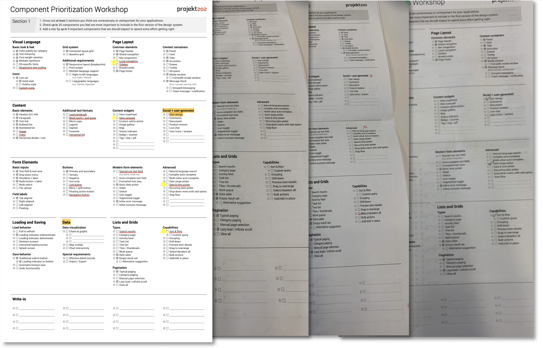
To decide which components to include, I conducted a component prioritization workshop.
Participants : 4 developers from SDLC
Participants are asked to
1. Cross out at least 2 sections that are unnecessary or unimportant.
2. Check up to 25 components that are most important to include in the first version of the design system.
3. Add a star by up to 5 important components that we should expect to spend extra effort getting right.
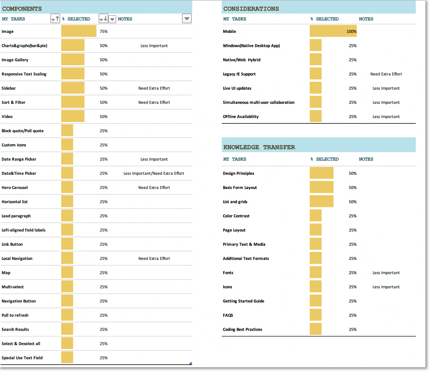
Result
Image, charts and graphics, responsive text scaling, sidebar, sort and filter and video seems to need extra effort to work on.
Responsiveness, especially mobile view of the components need to be considered.
Design principles, as well as basic layout rules and grid system need to be explained.
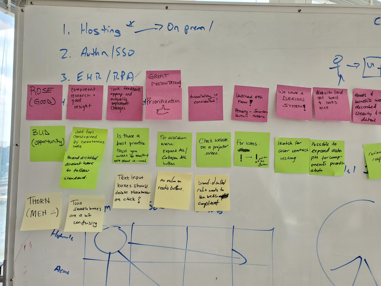
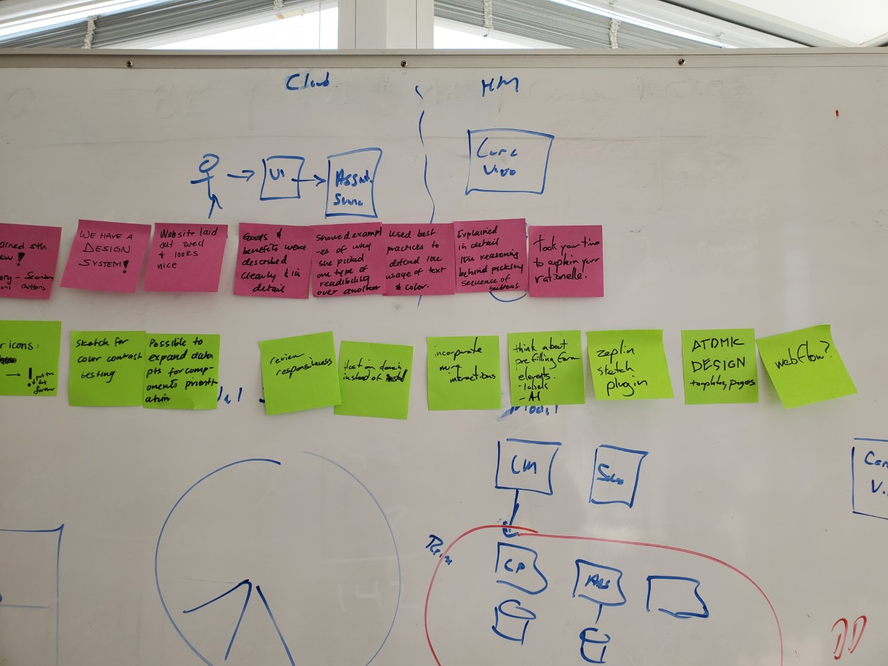
Metric 2 - Design Critique Workshop(Rose/Buds/Thorn)
To gather feedback from other designers, I conducted design critique sessions with SDLC's HCD (Human Centered Design) group every month.
After reviewing the design system, SDLC's HCD group was asked to document their observations and opinions on sticky notes as positive, negative or having potential.
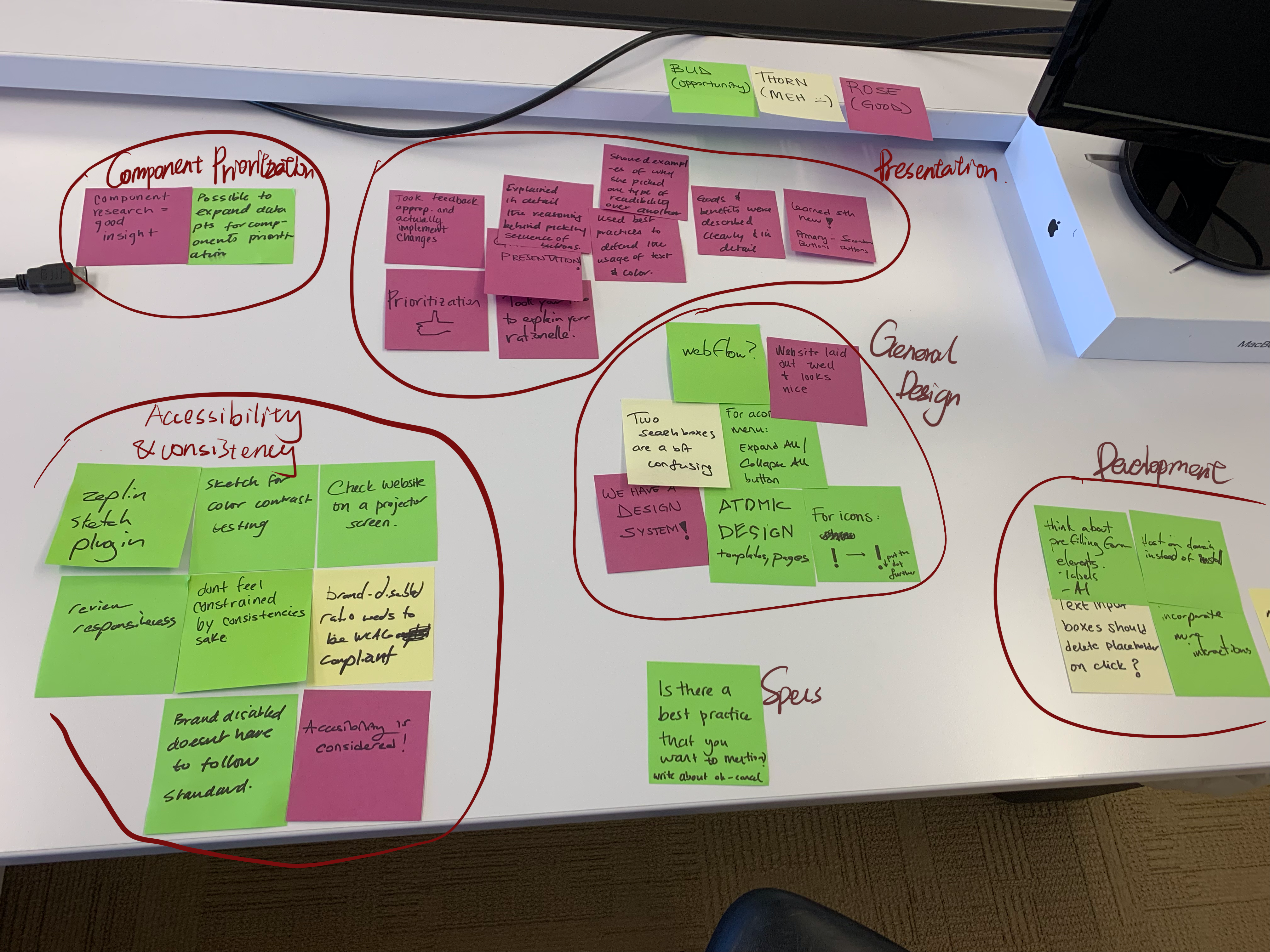
Team members were asked to sort their notes based on similarities. Multiple notes highlighting similar observations were indicators of problematic issues.
Example Takeaways:
1. Test the accessibility of colors.
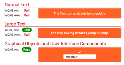
For the color palette, I used the colors from SDLC's marketing brand book. After a design session, it was suggested I adjust the color palette to meet WCAG AA standards. After reviewing the color contrast, I found that most of the dominant and accent colors need to be adjusted. Here are some of them:
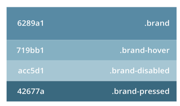
before
3.74:1
2.98:1
1.8:1
6.08:1
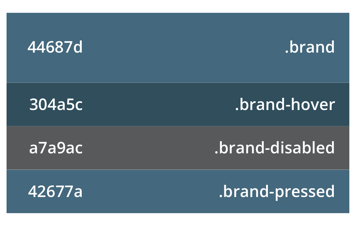
after
5.96:1
9.29:1
6.98:1
6.08:1
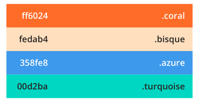
before
3.0:1
15.9:1
3.3:1
10.9:1

after
4.64:1
WCAG level AA requires a contrast ratio of at least 4.5:1 for normal text and 3:1 for large text. Large text is defined as 14 point (typically 18.66px) and bold or larger, or 18 point (typically 24px) or larger.

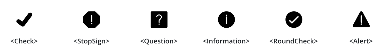
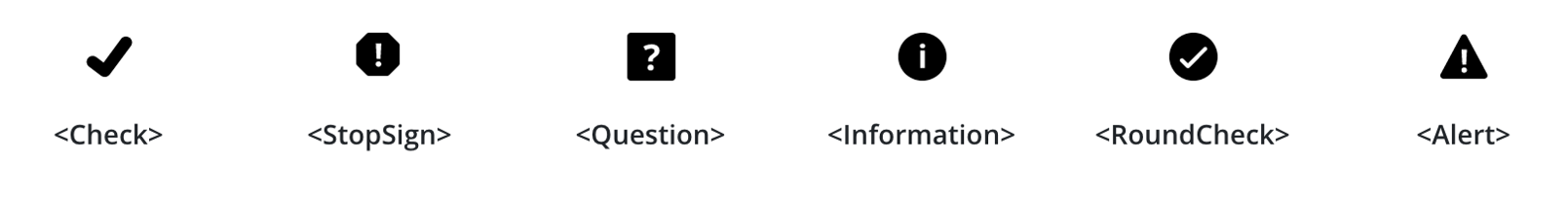
2. Redesign the icons considering the minimum stroke size.
Before:
After: